

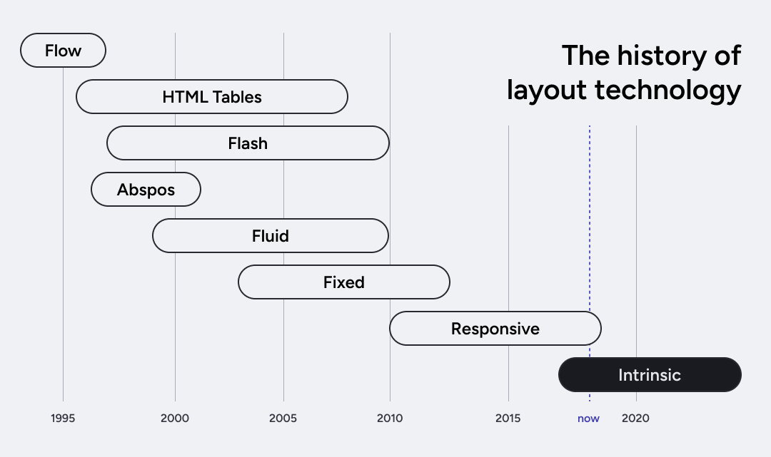
Not long ago, the only way we accessed the web was through desktop computers. In less than two decades, technological advancements have taken us from a predictable world of desktop monitors to one filled with smartphones, tablets, smartwatches, and connected TVs. In this universe of screens that fold and expand, web design had to reinvent itself. And in this quest for simpler development, a disruptive approach has emerged: Intrinsic Design.
Intrinsic Thinking
For years, the answer to the diversity of devices was traditional responsive design, heavily reliant on media queries. We defined specific breakpoints and rules for each screen size. It worked, but it was often labor-intensive and fragile.
Intrinsic Design proposes something different: using the natural characteristics of modern CSS to create layouts that adapt organically to their environment. Instead of dictating exactly how each element should behave in every situation, we allow them to naturally respond to the available space. This way, we create fluid and adaptable experiences, making full use of each element’s intrinsic capabilities.
Fundamentals of Intrinsic Design
While the concept of Intrinsic Design may seem new, its development took place between 2018 and 2019, when Jen Simmons was working as a Designer Advocate at Mozilla. During this period, she introduced this approach through influential talks and her YouTube channel, Layout Land. Through these materials, Jen highlighted the key principles of Intrinsic Design:
- Inherent flexibility: Elements automatically adjust to the available space.
- Local decision-making: Components respond to their immediate context without relying on complex global rules.
- Conscious use of space: Layouts maximize efficiency and aesthetics without wasting useful areas.
Intrinsic Design in Practice
Make no mistake—media queries are still essential! Intrinsic Design works in harmony with them rather than replacing them entirely.
The real shift in thinking is that:
We first focus on creating naturally adaptive layouts using intrinsic CSS properties, such as:
min-content/max-contentfit-contentauto-fit/auto-fillminmax()clamp()
We then use media queries strategically, only when necessary, for:
- Fine-tuning layouts
- Significant changes in element arrangement
- Device-specific adaptations
- Performance optimizations
It’s like an inverted pyramid—we start with natural, intrinsic responsiveness and only apply media queries where they truly make a difference.
Example: A Grid of Cards
A great example is when designing a card grid. Instead of defining exact breakpoints for different screen sizes, we can let CSS handle most of the adaptability.